A1: Panel 1, I really like the gradient effect you used in the image from orange to yellow. It really makes it seem like the sun is rising. A2: Panel 6, The space in this panel feels a lot flatter than all of the others. I do like how you used horizontal colored stripes at the top though, it feels like a sunset. A3: The colors are all very cohesive. It really feels like a natural progression that makes sense with how the light is throughout the day.
Your picture of the URBN Center is the one I find the most visually appealing. I absolutely love the look you gave it using the gradient, and its overall just beautiful to look at.
The least interesting composition, in my opinion, is the monochromatic composition. It's not the fact that the picture isn't well done, but the entire premise of a monochromatic composition is just boring.
Although the flow of the book in terms of story is kind of random, I absolutely love the color flow.
A1 - The color concepts that were used in the double page composition are visually striking. The amount of color stands out compared to the other compositions in the book. A2 - The least visually striking color concept in the book is the monochromatic composition. It feels like there could be a few more colors expressed in the composition. A3- The flow of the book is very good. All of the colors that were used are brought together in the middle composition and it works very well.
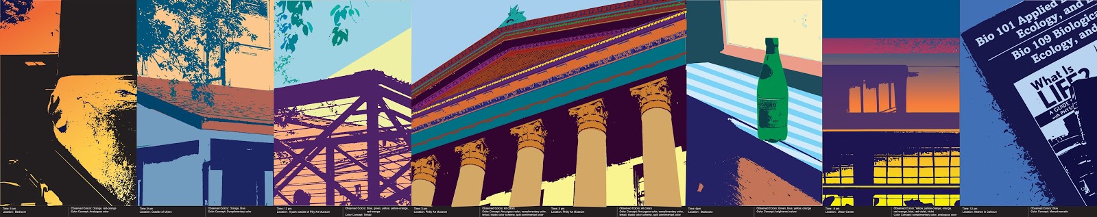
A1: Panel 1, I really like the gradient effect you used in the image from orange to yellow. It really makes it seem like the sun is rising.
ReplyDeleteA2: Panel 6, The space in this panel feels a lot flatter than all of the others. I do like how you used horizontal colored stripes at the top though, it feels like a sunset.
A3: The colors are all very cohesive. It really feels like a natural progression that makes sense with how the light is throughout the day.
Your picture of the URBN Center is the one I find the most visually appealing. I absolutely love the look you gave it using the gradient, and its overall just beautiful to look at.
ReplyDeleteThe least interesting composition, in my opinion, is the monochromatic composition. It's not the fact that the picture isn't well done, but the entire premise of a monochromatic composition is just boring.
Although the flow of the book in terms of story is kind of random, I absolutely love the color flow.
A1 - The color concepts that were used in the double page composition are visually striking. The amount of color stands out compared to the other compositions in the book.
ReplyDeleteA2 - The least visually striking color concept in the book is the monochromatic composition. It feels like there could be a few more colors expressed in the composition.
A3- The flow of the book is very good. All of the colors that were used are brought together in the middle composition and it works very well.